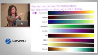
For researchers and data scientists working with Python, Matplotlib is the foundational library for creating publication-quality graphics. However, relying on its default color settings can produce visualizations that are not only generic but can also obscure data patterns and lack accessibility. Unlocking advanced color techniques is essential for creating clear, impactful, and reproducible figures that meet the rigorous standards of modern analysis.
The Problem with Default Palettes
The standard Matplotlib color cycle and jet-like colormaps, while familiar, present several challenges. The default line colors can be difficult to distinguish, especially for viewers with color vision deficiencies. Furthermore, sequential colormaps like "jet" can create misleading perceptual gradients, where sharp color changes are interpreted as data discontinuencies that don't exist. For a detail-oriented researcher, these issues compromise data integrity and communication clarity.Core Solution: Perceptually Uniform Colormaps
The most critical advancement is moving toward perceptually uniform colormaps. These palettes are designed so that equal steps in data value correspond to equal perceived changes in color. The Matplotlib library now includes excellent options like "viridis," "cividis," and "plasma." "Viridis," in particular, has become a new standard for its uniformity, elegance, and suitability for both screen viewing and black-and-white printing. Using these colormaps is a straightforward upgrade that immediately improves visualization fidelity.Advanced Techniques for Research Figures
Beyond selecting a single colormap, advanced color control involves several key strategies: * **Creating Custom Sequential or Diverging Palettes:** Using tools like the `LinearSegmentedColormap` class allows you to build palettes that perfectly match your data's narrative, such as diverging around a meaningful zero point with carefully chosen endpoints. * **Integrating Seaborn for Palette Context:** While Matplotlib provides the core tools, the Seaborn library offers higher-level functions like `color_palette()` and `diverging_palette()` that simplify the creation of sophisticated, aesthetically consistent palettes tailored to your data's type (categorical, sequential, diverging). * **Ensuring Accessibility:** Always test your visualizations. Use online tools or packages to simulate colorblind vision. Choosing palettes like "cividis" or combining color with shape markers in scatter plots ensures your work is accessible to the widest possible audience. * **Dynamic Theme Integration:** For a truly cohesive look, you can create and register custom color cycles and colormaps as part of a Matplotlib style context. This ensures consistency across all figures in a multi-part study or presentation.Practical Workflow and Implications
Integrating advanced colors does not require a complete rewrite of your plotting code. Start by replacing "jet" or "rainbow" with "viridis" or "plasma" in your next heatmap or contour plot. For line plots, define a custom list of perceptually distinct colors and set it as the default cycle. The implication is a significant leap in the professionalism and communicative power of your visual work. Properly colored data doesn't just look better; it reveals truth more effectively and withstands scrutiny in peer review.Key Takeaway: Deliberate color selection is not decoration—it is a core component of rigorous data visualization. By leveraging Matplotlib's advanced color tools, researchers can produce figures that are not only visually compelling but also technically accurate and inclusive.

Google Scholar Usa _ Google Scholar Advanced Search – LDDDM

google scholar usa _ google scholar advanced search – LDDDM